Objectives
︎ Brand Memorability
︎ Better Quality Applicants
︎ Increase Investors’ Trust
Capabilities
︎ Brand Design
︎ Motion Design
︎ Marketing
View Full Presentation ︎︎︎
︎ Brand Memorability
︎ Better Quality Applicants
︎ Increase Investors’ Trust
Capabilities
︎ Brand Design
︎ Motion Design
︎ Marketing
View Full Presentation ︎︎︎
SaaS Employer Branding
Incident.io helps companies like Etsy, Netflix, and Ramp automate and streamline their incident response processes, making issue resolution faster and more efficient.
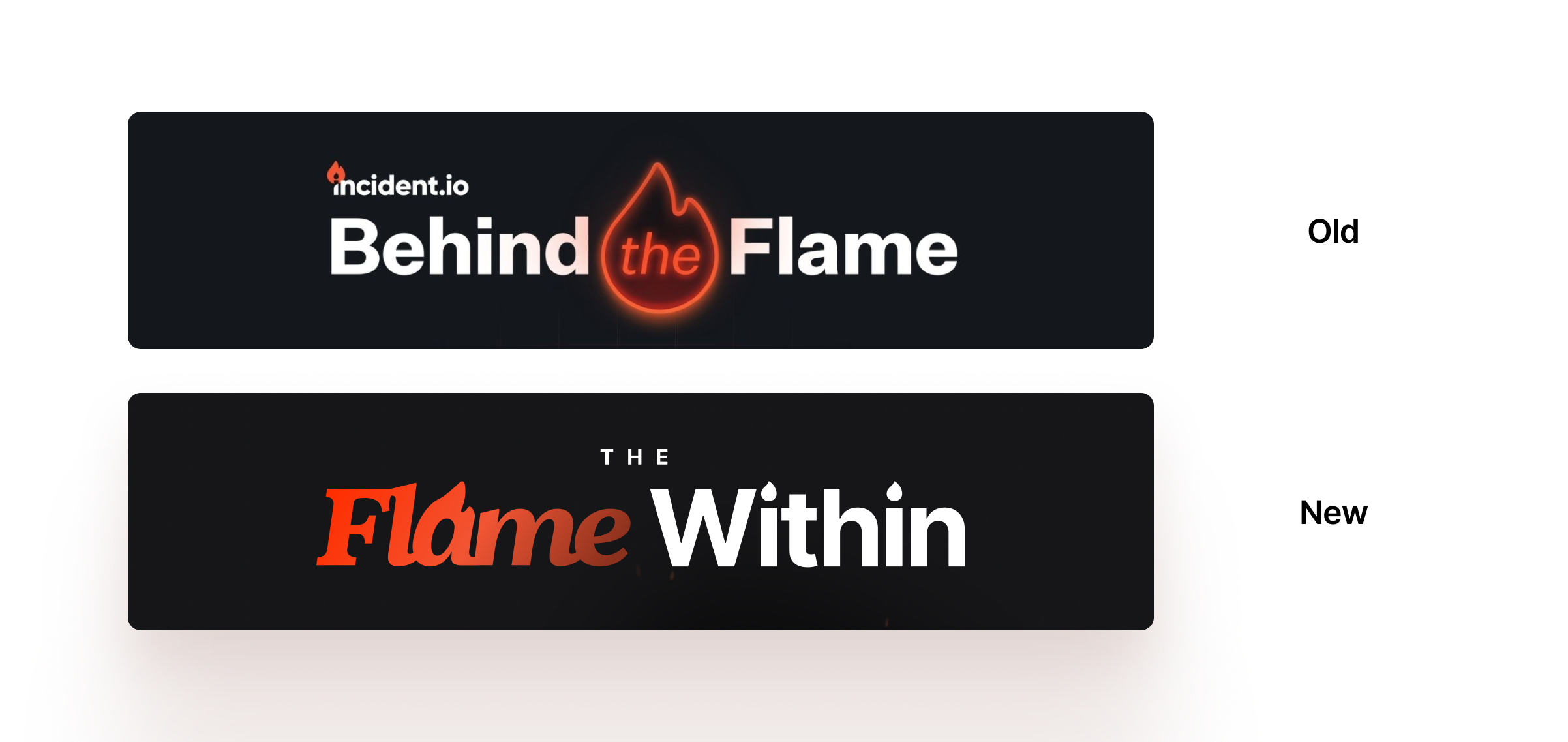
Acting as a Design and Brand Director, the brief highlighted the need for new employer branding. The visual identity of Behind the Flame felt overused and not in line with the updated image incident.io has been conveying recently.
![]()
An example of how Behind the Flame devolves in a social post
The key visual element of incident.io is the flame, however, the redundancy of the icon made it lose power and identity.
After researching the culture and employees’ unique personalities, it is clear that their passion for their job is magnetic, and a key element to retain and highlight in the sub-brand.
![]()
Starting with that connection sparked the idea of The Flame Within, highlighting the beauty of such a passionate culture of bright minds.
The main typography element, the a in Flame, is used as accent to accentuate the idea of fire as passion, tying together with the logo, without creating visual redundancy.![]()
The LinkedIn carousel includes a thumb-stopper slide designed to stand out in both dark and light modes. It showcases the logo, a picture of the interviewee and their name and role.
The slides following the hero have a minimal yet detailed design, the users have already engaged and we now hook them with a Japanese-inspired layout.
![]()
The web series’ intro structure and layout will be shared among all the episodes. It revolves around the element of fire, anticipating the idea of a fireside chat with the interviewee.
The speaker is introduced by a polaroid of themselves, name and role tag. The picture magically takes life, turning into a quick video where the speaker waves and says hi, welcoming the viewer.
![]()
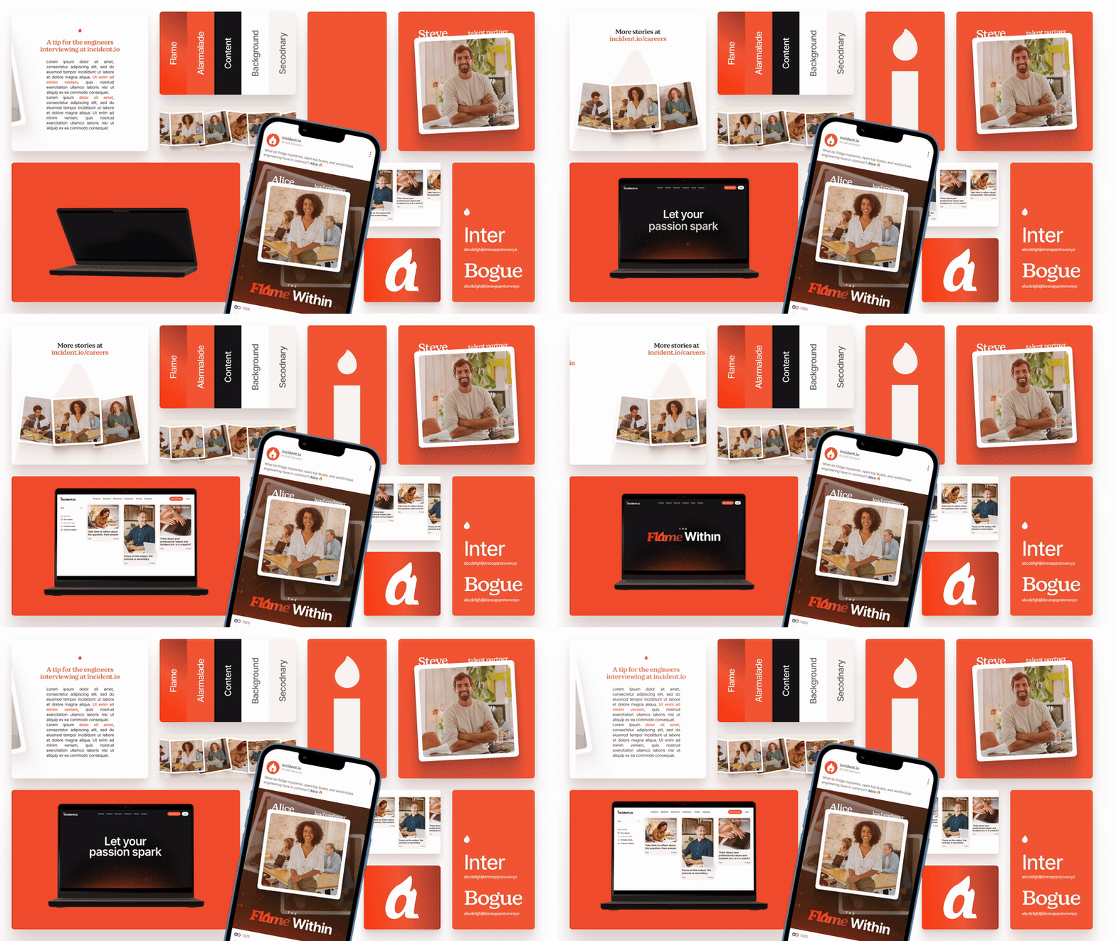
The employer brand is designed to be showcased on its landing page, creating one source of truth behind the team culture, concentrating tips, chats and values in one place.
It will be useful for potential candidates and for curious potential investors.
![]()
Overall, the new sub-brand, inspired by the old iteration, leverages its elegance and care of detail, with the visual accents and the pair of serif and san-serif fonts.
It has the opportunity to higher the quality of applicants, create a culture based on transparency, and further support securing investors.
![]()
Acting as a Design and Brand Director, the brief highlighted the need for new employer branding. The visual identity of Behind the Flame felt overused and not in line with the updated image incident.io has been conveying recently.

An example of how Behind the Flame devolves in a social post
The key visual element of incident.io is the flame, however, the redundancy of the icon made it lose power and identity.
After researching the culture and employees’ unique personalities, it is clear that their passion for their job is magnetic, and a key element to retain and highlight in the sub-brand.

Starting with that connection sparked the idea of The Flame Within, highlighting the beauty of such a passionate culture of bright minds.
The main typography element, the a in Flame, is used as accent to accentuate the idea of fire as passion, tying together with the logo, without creating visual redundancy.
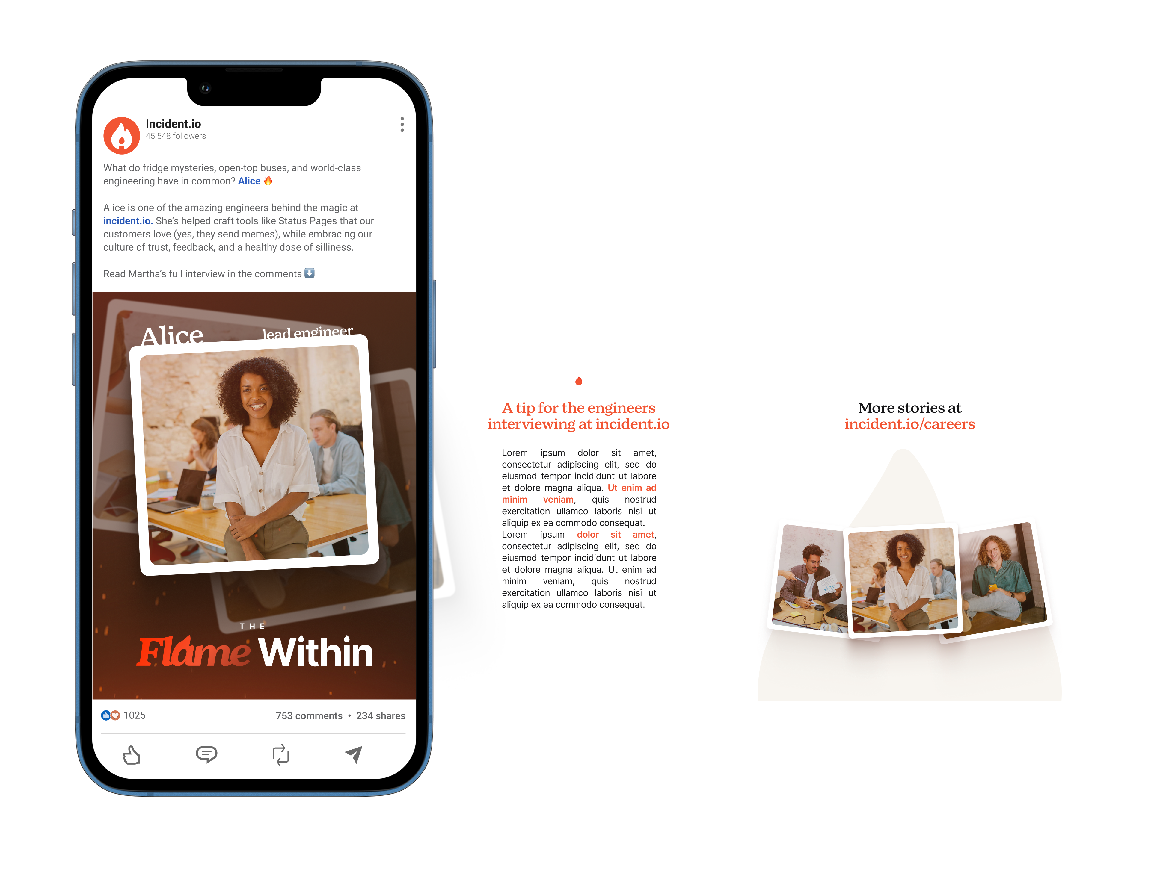
The LinkedIn carousel includes a thumb-stopper slide designed to stand out in both dark and light modes. It showcases the logo, a picture of the interviewee and their name and role.
The slides following the hero have a minimal yet detailed design, the users have already engaged and we now hook them with a Japanese-inspired layout.

The web series’ intro structure and layout will be shared among all the episodes. It revolves around the element of fire, anticipating the idea of a fireside chat with the interviewee.
The speaker is introduced by a polaroid of themselves, name and role tag. The picture magically takes life, turning into a quick video where the speaker waves and says hi, welcoming the viewer.

The employer brand is designed to be showcased on its landing page, creating one source of truth behind the team culture, concentrating tips, chats and values in one place.
It will be useful for potential candidates and for curious potential investors.
Overall, the new sub-brand, inspired by the old iteration, leverages its elegance and care of detail, with the visual accents and the pair of serif and san-serif fonts.
It has the opportunity to higher the quality of applicants, create a culture based on transparency, and further support securing investors.

Recap
Acting as the Design Brand Director I strategised and designed Incident.io's new employer branding, "The Flame Within". It aims to revitalize its image by moving away from the overused "Behind the Flame" concept and emphasizing the passionate culture of its employees. It uses a refined visual identity, centered on the "a" in "Flame" as a subtle fire accent, and incorporates Japanese-inspired layouts for engaging social media content. The initiative creates a dedicated landing page for transparency and aims to attract top talent and investors through a more sophisticated and detail-oriented approach.
Acting as the Design Brand Director I strategised and designed Incident.io's new employer branding, "The Flame Within". It aims to revitalize its image by moving away from the overused "Behind the Flame" concept and emphasizing the passionate culture of its employees. It uses a refined visual identity, centered on the "a" in "Flame" as a subtle fire accent, and incorporates Japanese-inspired layouts for engaging social media content. The initiative creates a dedicated landing page for transparency and aims to attract top talent and investors through a more sophisticated and detail-oriented approach.